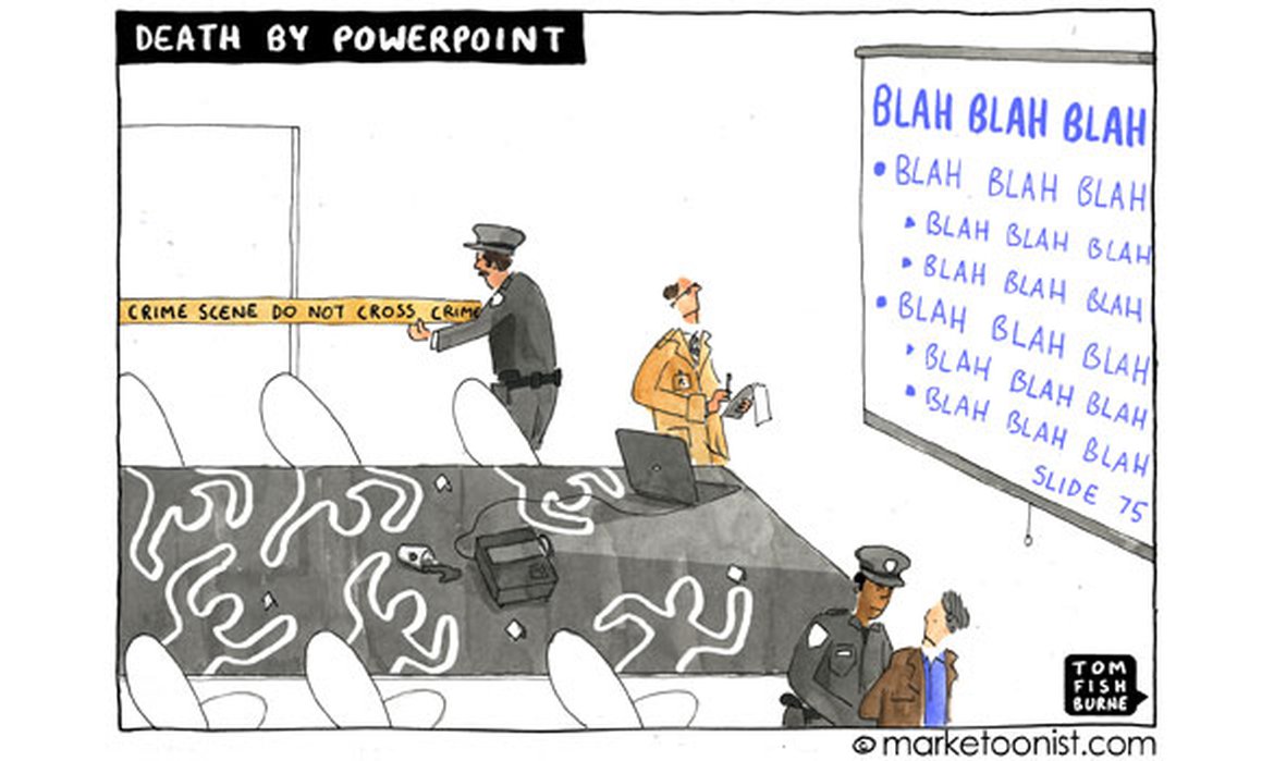
Death by PowerPoint
June 27, 2019

I confess that I am a fan of Winnie-the-Pooh. Not the cartoonish Disney version, mind. I’m talking about the original Pooh Bear created by A.A. Milne in 1926 and so beautifully brought to life by Ernest H. Shepard’s simple line drawings.
I was first introduced to Winnie-the-Pooh as a child, but I’ve re-read Milne’s collections of stories many times as an adult too. There is something about that Silly Old Bear and all his friends in the Hundred Acre Forest – Piglet, Owl, Rabbit, Eeyore, Kanga and of course, Christopher Robin – that I find so endearing and so true.
Not surprisingly, my favourite bits from Winnie-the-Pooh have to do with words or communication. Take this little exchange, for example, in which Pooh and Piglet are talking about Rabbit:
“Rabbit's clever," said Pooh thoughtfully.
"Yes," said Piglet, "Rabbit's clever."
"And he has Brain."
"Yes," said Piglet, "Rabbit has Brain."
There was a long silence.
"I suppose," said Pooh, "that that's why he never understands anything."
Or this, when Pooh seeks Owl’s help to find his friend Eeyore’s lost tail:
"Hallo, Pooh," [Owl] said. "How's things?"
"Terrible and Sad," said Pooh, "because Eeyore, who is a friend of mine, has lost his tail. And he's Moping about it. So could you very kindly tell me how to find it for him?"
"Well," said Owl, "the customary procedure in such cases is as follows."
"What does Crustimoney Proseedcake mean?" said Pooh. "For I am a Bear of Very Little Brain, and long words Bother me."
"It means the Thing to Do."
When it comes to presentations, it seems that the Thing to Do, is to bore us all to death. Sorry folks, but slide after slide with endless lists of bullets just doesn’t cut it anymore. It’s just not that engaging – or persuasive.
Well, I say it’s high time we agreed to ditch the Crustimoney Proseedcake and start thinking about how to do things differently.
How might you do that, you ask?
Tip No. 1: A great presentation doesn’t start with PowerPoint; it starts with a plan.
I have nothing against PowerPoint (or Keynote), but if you think you can create a great presentation by jumping in at slide 1 and blithely filling in the bullet template, think again.
Not planning your presentation is like building a house without a blueprint. It’s like banging up the door, then wondering, now, where shall we go from there? No foundation, no structure, and the house simply won't stand.
A presentation is the same: If you haven’t first mapped out your ideas, giving careful thought to your main point and how you’ll support that throughout the presentation, it doesn’t matter how many fancy slides you include or which new whizz-bang tool you have at your disposal. It won’t add up to a coherent, cohesive message that the audience will remember.
So, before you even begin to think about your “slides”, you need to figure out what the heck you’re going to say. Instead of turning to PowerPoint, open Word. Or haul out a white board. Or pick up a pen and paper, a pack of sticky notes, a stack of note cards. Even a napkin will do in a pinch. The point is, get your ideas down and create a detailed outline.
To help in this process, here are two excellent resources:
- The Presentation Secrets of Steve Jobs: How to Be Insanely Great in Front of Any Audience by Carmine Gallo
- Presentationzen: Simple Ideas on Presentation Design and Delivery by Garr Reynolds
Tip No. 2: Your slides are for the audience; they are not your script.
Cognitive studies have shown that people can’t read and listen at the same time; in the battle for eyes and ears, the eyes will win out.
The problem with the typical, text-heavy, bullet-list format, then, is that you end up competing with yourself for the audience’s attention. You may as well sit down and wait until your audience has read the slide, click to the next one, and repeat, ad infinitum, until the cobwebs gather.
In Presentationzen, Garr Reynolds calls the typical presentation a “slideument” – a hybrid between a document and a slide deck. That’s fine for a report that is primarily meant to be read. But in a live presentation, your slides should serve to emphasize and reinforce your message, not be the whole message.
If you absolutely need to provide your audience with a “script,” it is much more effective to present first, then leave them with a detailed written document that they can read later and fully absorb.
The beauty of first creating the detailed plan or outline, is that you are then able to thoughtfully consider how best to illustrate your points. Strive to create slides that are simple, memorable and visual. Reynolds recommends using bullets only when you have considered other options to convey the information: Images, graphs (simple ones!), and big, bold numbers are much more powerful than a bulleted list.
Of course, so much more goes into a great presentation – you need to think about storytelling, you need to rehearse, and you need to hone your ability to connect emotionally with your audience (to name just a few things). However, the two tips discussed here are fundamental. Commit to these, and I guarantee you will be well on the way to presentation excellence.
Remember this:
For a great presentation, start with a plan, add visually interesting slides, and ditch the bullets.
Presentations